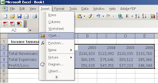
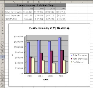
First step of all, you need to enter the data into the spreadsheet. From the figure below, you can see an example of data.

Using your mouse to drag and highlight the cells that contain the titles and data to be included in the column chart.

Next, you need to select a chart type that you preferred the most. Choose menu Insert -> Chart.
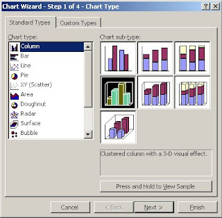
A Chart Wizard will appear as shown below. Choose you desired type and click Next.
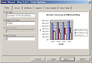
You can format your column chart, such as adding a title, Category (X) axis and Value (Z) axis to the chart, shows label which contains series name, category name or value, shows data table on your chart, and etc.
Click Next to continue, you can then choose to put the formatted chart to a new sheet or existing sheet.
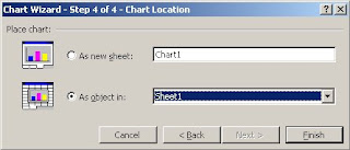
Click Finish. Now you can see a chart on your spreadsheet.


0 comments:
Post a Comment